
Radix UI
Unstyled, accessible React primitives such as dialogs, menus and popovers, plus Radix Themes and a set of colour scales and icons.
At a glance
Checked
- Pricing
- Free: Primitives, Themes, Colors and Icons, all open source under the MIT licence
- Licence
- MIT, open source
- GitHub
- github.com/radix-ui/primitives19.5k stars · 1.3k forks · written in TypeScriptFrom GitHub, updated at every build
- Made by
- WorkOS
- Platforms
- React
- Website
- radix-ui.com
What it’s good for
Radix Primitives are unstyled, accessible React components for the hard parts of an interface: dialogs, dropdown menus, popovers, sliders, tabs, accordions, switches and more. They handle the behaviour and accessibility and leave the styling to you, and each component is its own versioned package, so you can adopt them one at a time.
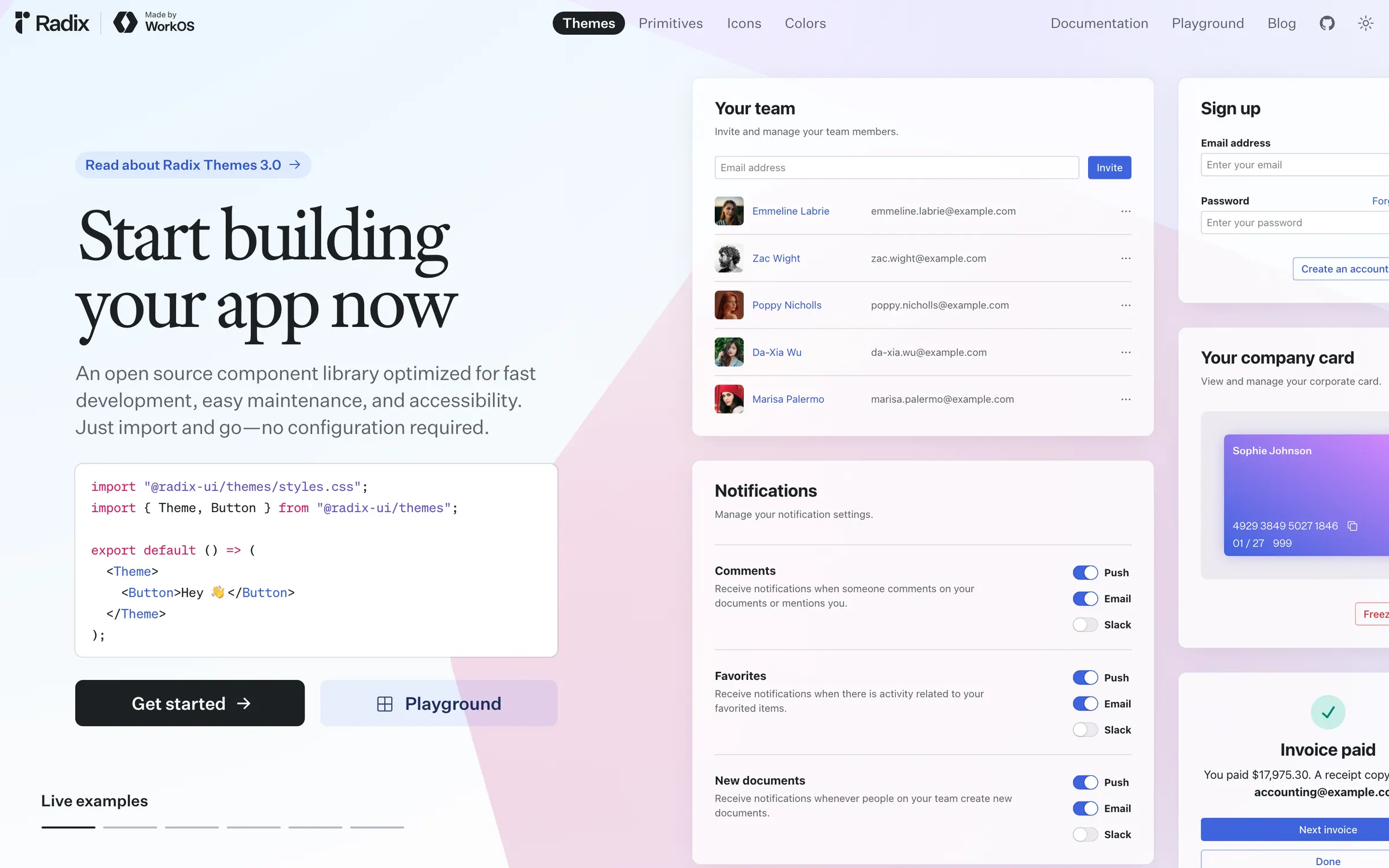
Radix Themes builds on them as a styled component library you import and use with no configuration, and the project also publishes Radix Colors and Radix Icons. It suits developers building their own design system in React, or anyone who wants a styled starting point from the same team. Everything is free and open source under the MIT licence, made by WorkOS.
Alternatives to Radix UI
All UI Design tools
React Aria
Adobe's take on unstyled React components, with hooks underneath for full control and support for internationalisation.
UI Design

Headless UI
The Tailwind CSS team's unstyled components, which cover Vue as well as React.
UI Design


Questions
- Is Radix UI free?
- Yes. Radix Primitives, Radix Themes, Radix Colors and Radix Icons are open source under the MIT licence, and there is no paid plan.
- What is the difference between Radix Primitives and Radix Themes?
- Primitives are unstyled components that you style yourself. Themes is a styled component library from the same team that you import and use without any configuration.